
Rebuilding the healthcare commerce ecosystem
As the sole Product Designer at Weglow, I led the redesign of the company's healthcare commerce ecosystem across four platforms: Client, CRM, Admin, and Affiliate. When I joined, the project had spent two and a half years building only a login flow. No one on the team had a full picture of how the services connected or which operational policies drove them. Development and operations also spoke past each other, using entirely different vocabularies for the same features.
I stepped into that gap. I translated between teams, mapped connections no one had documented, and turned fragmented processes into a coherent system. Through drop-off analysis, user interviews, and competitive research, I identified the key friction points and partnered with both teams to design and ship practical, user-centered solutions across all four platforms.
Business Impact
+36%
Checkout Completion
-60%
Operational Workload
-80%
Shipping Workload
2d → 3h
Onboarding Speed
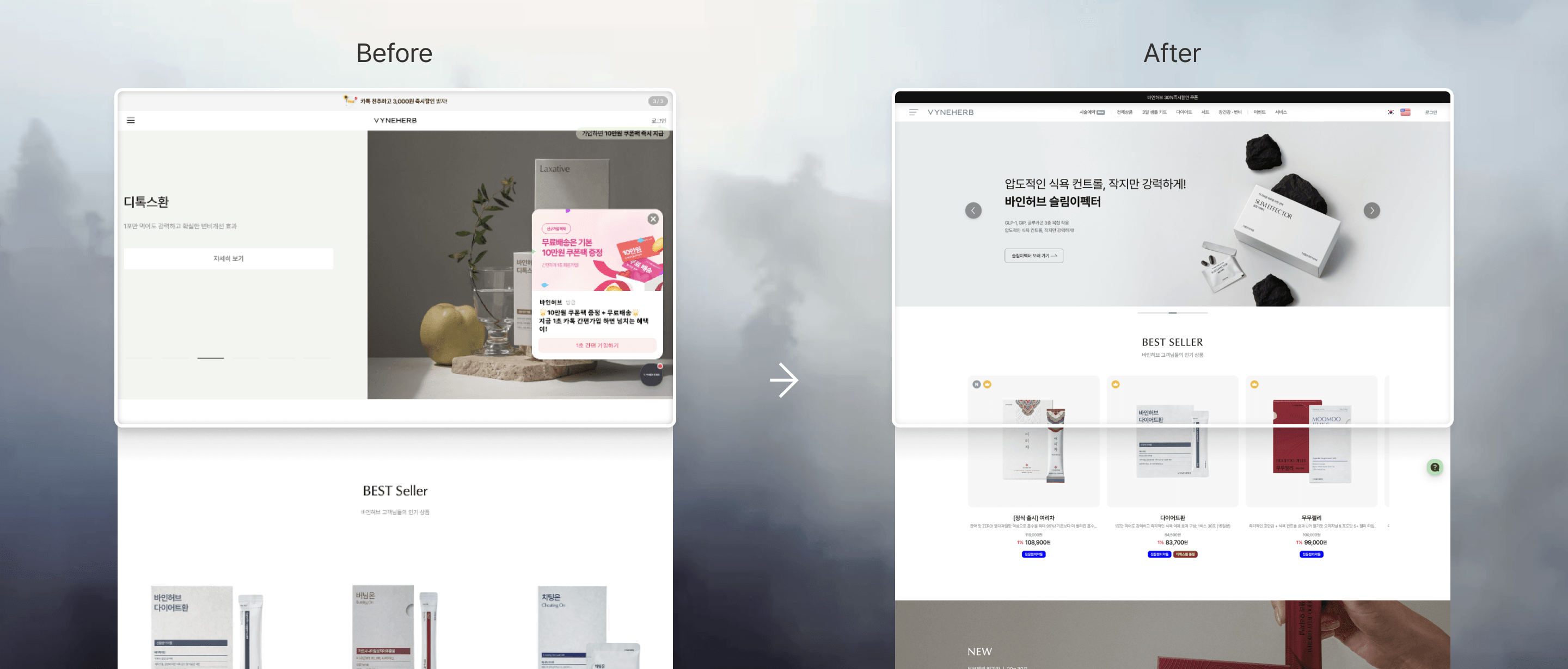
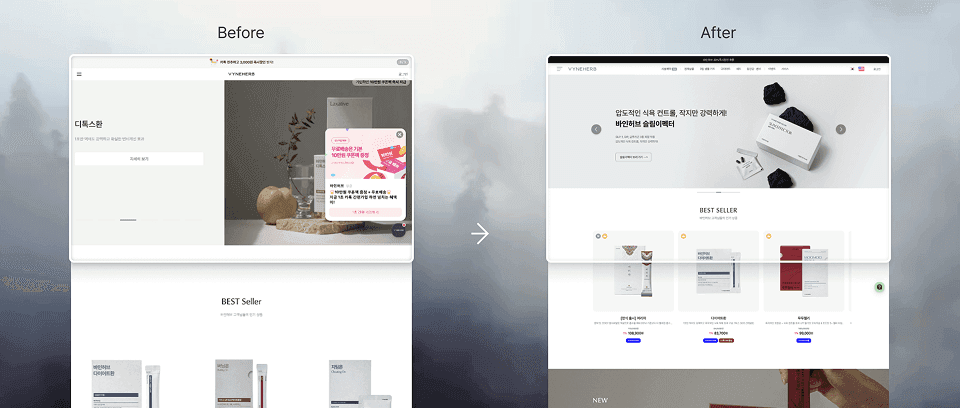
Main Page
Redesigned layout to show more per screen, cueing users to keep scrolling.
Case Studies
Identified a major drop-off point in the checkout flow and redesigned the payment step, increasing checkout completion by 36%.
Problem
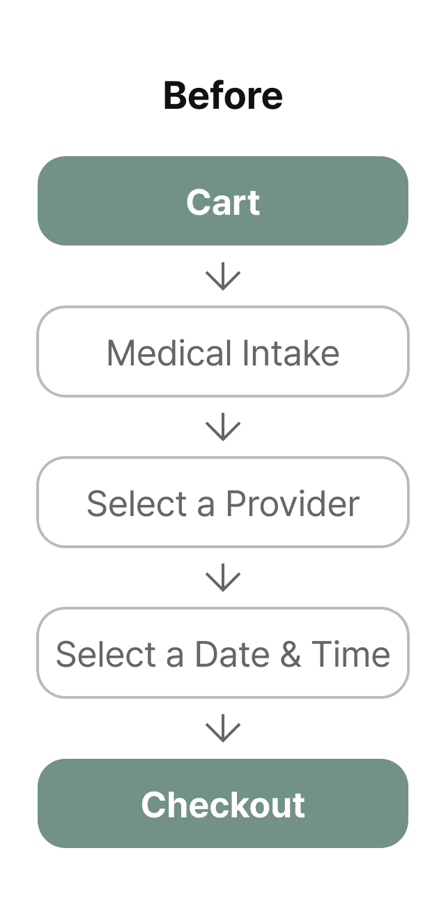
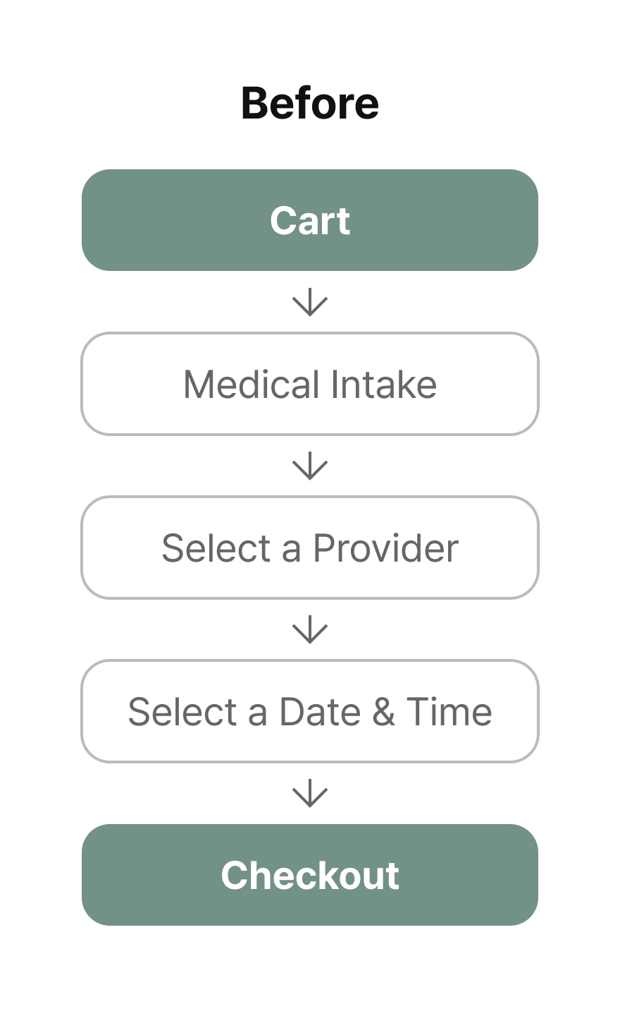
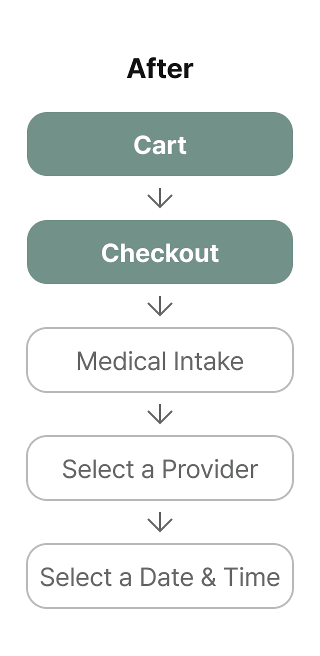
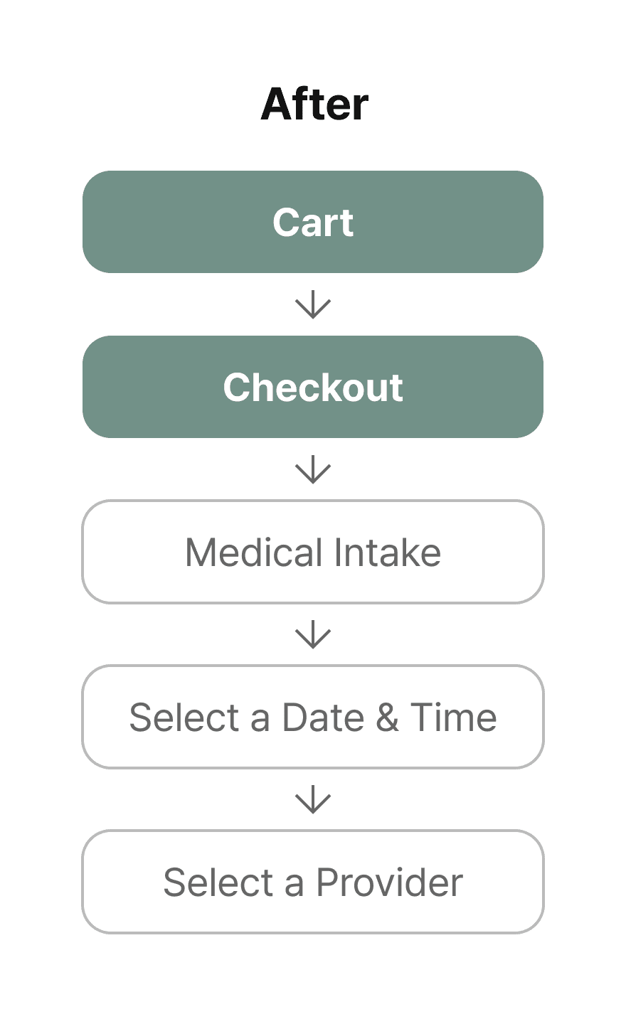
Weglow sells products that require a medical prescription, meaning customers must complete a medical questionnaire before their order can be fulfilled. The original flow required this step before payment, and a significant number of users were dropping off at this point, never completing their purchase.
Constraint
My proposed fix was simple: move payment first, questionnaire second. But this introduced a critical risk. Since prescription products can’t be shipped without a completed medical consultation, any customer who pays but skips the questionnaire ends up with an unshippable order. This would not only frustrate users but also create a wave of cancellations and customer support requests on the operations side.
Solution
I moved forward with the reordered flow and designed a three-layer system to ensure every paying customer completes the questionnaire.
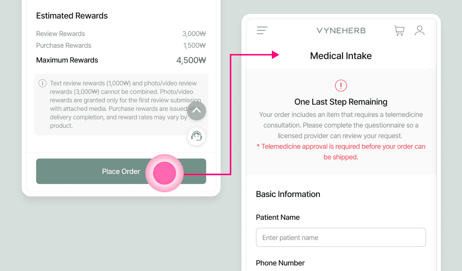
A. Immediate redirect
Upon payment completion, users are automatically taken to the questionnaire page, making it the clear and natural next step.
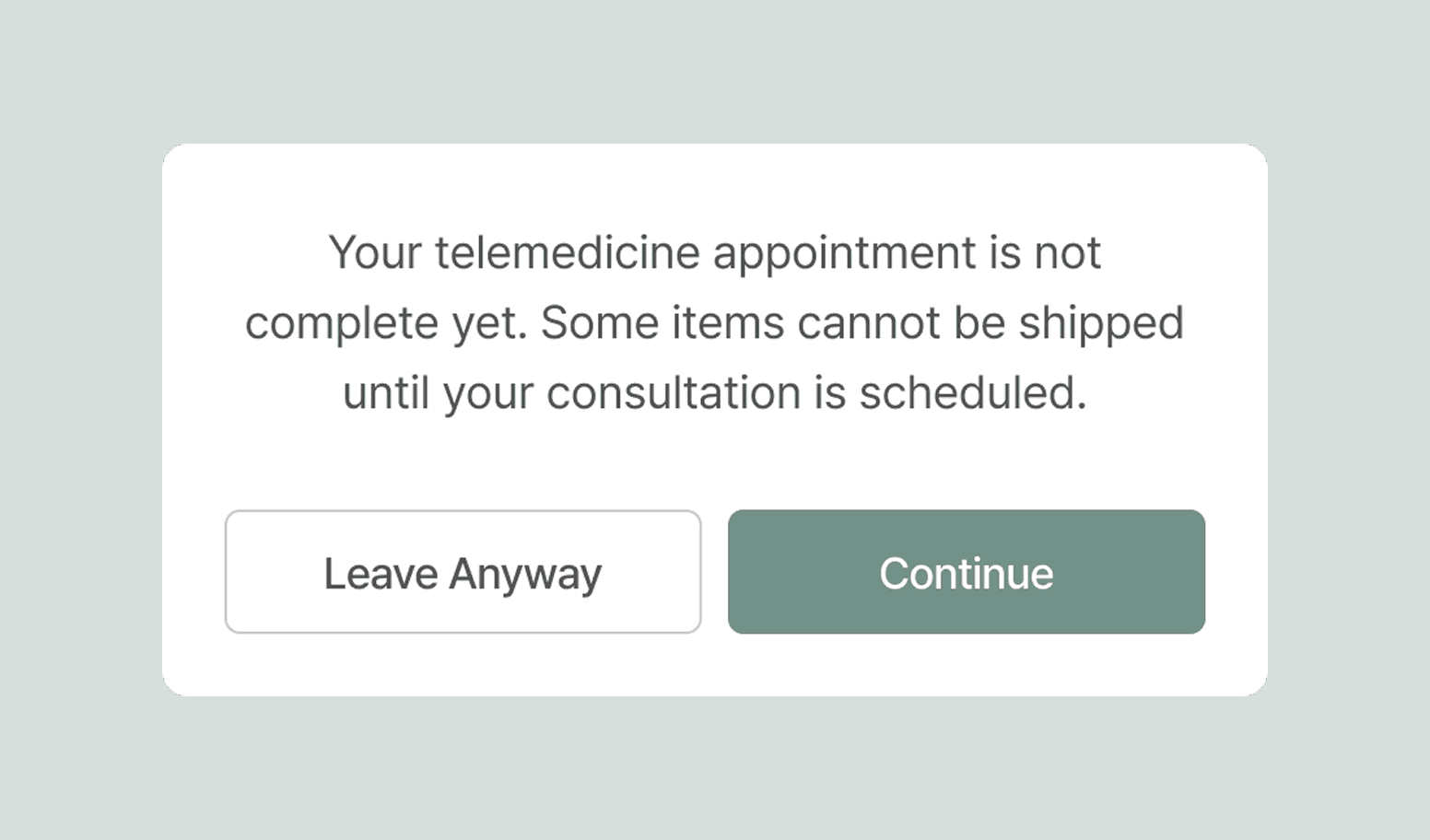
B. Modal alert
If a user attempts to navigate away before finishing, a warning message appears explaining that their order can’t be shipped until the questionnaire is submitted.
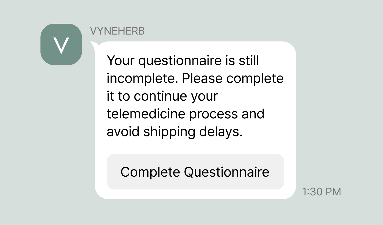
C. Automated follow-up message
For users who close the page entirely, an automated reminder is sent via direct messaging channel after a set period of inactivity, prompting them to return and complete the step.
Outcome
- +36% increase in checkout completion rate.
- Prevented post-payment questionnaire abandonment.
- Reduced friction in the telemedicine purchase flow.